" height="90.30000045776367px" id="Tu119EZZY" transform="translate(105 0)" width="720.150009765625px"/><path d="M 29.62 59.253 C 13.299 59.253 0 46.072 0 29.626 C 0 13.302 13.298 0 29.62 0 Z M 88.859 59.374 C 88.859 75.698 75.681 89 59.24 89 C 42.918 89 29.62 75.698 29.619 59.374 Z" fill="rgb(0, 0, 0)" height="89.00000054931641px" id="sqCofdzoM" transform="translate(0 1)" width="88.85899948120118px"/><path d="M 29.62 59.011 L 0 59.011 C 0 75.335 13.299 88.637 29.62 88.637 Z M 59.24 58.527 C 75.319 58.526 88.495 45.347 88.495 29.263 C 88.495 13.18 75.318 0 59.239 0 C 43.16 0 29.982 13.18 29.982 29.263 C 29.982 45.346 43.159 58.526 59.239 58.527 Z" fill="rgb(0, 0, 0)" height="88.63700158691407px" id="KVHbMuD7K" transform="translate(0 1.5)" width="88.49500035095215px"/></g></svg>)




8 min read
Aesop Sells Restraint
Category:
BRANDING & MARKETING
Updated:
Aug 21, 2026

Most people don’t need a $47 hand wash. Aesop knows this, which is why the brand doesn’t really sell hand wash first. It sells the world the hand wash belongs to.
Before the product has to justify the price, the store has already done half the work. You walk in and everything is controlled: the smell, the silence, the amber bottles, the sink, the lighting, the materials, the staff who somehow make soap feel like a consultation. There’s no shouting. No promotional panic. No shelf wobblers begging you to buy two and get one free.
Just restraint.
And restraint, when handled properly, signals taste.
Aesop was established in Melbourne in 1987. Its first store opened in 2003 in St Kilda, in what the brand describes as an underground nook that set the tone for its future architectural ambitions. You can still see that original instinct in the way Aesop behaves. It’s never felt like a beauty brand with a nicer label. It feels like a whole environment: product, packaging, store, service, architecture, smell, sound, language, and ritual all working from the same belief.
That’s where the aspiration starts. You don’t only want the product. You want the feeling of being inside the store.
The bottle is the portable version.
Visual restraint as power
Most brands confuse premium with addition. More colour. More messaging. More lifestyle photography. More expensive-looking finishes. More adjectives doing unpaid labour for a weak idea.
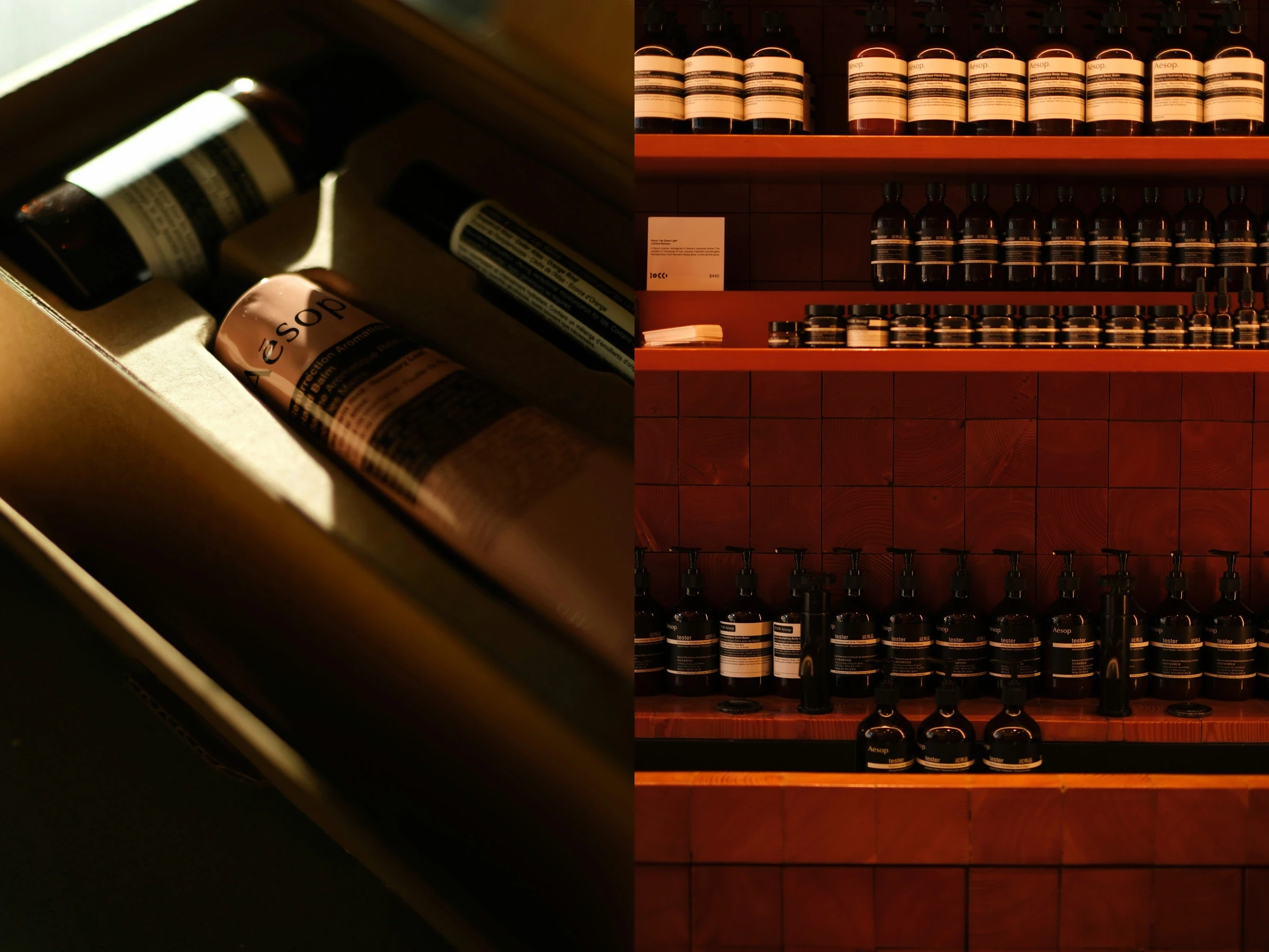
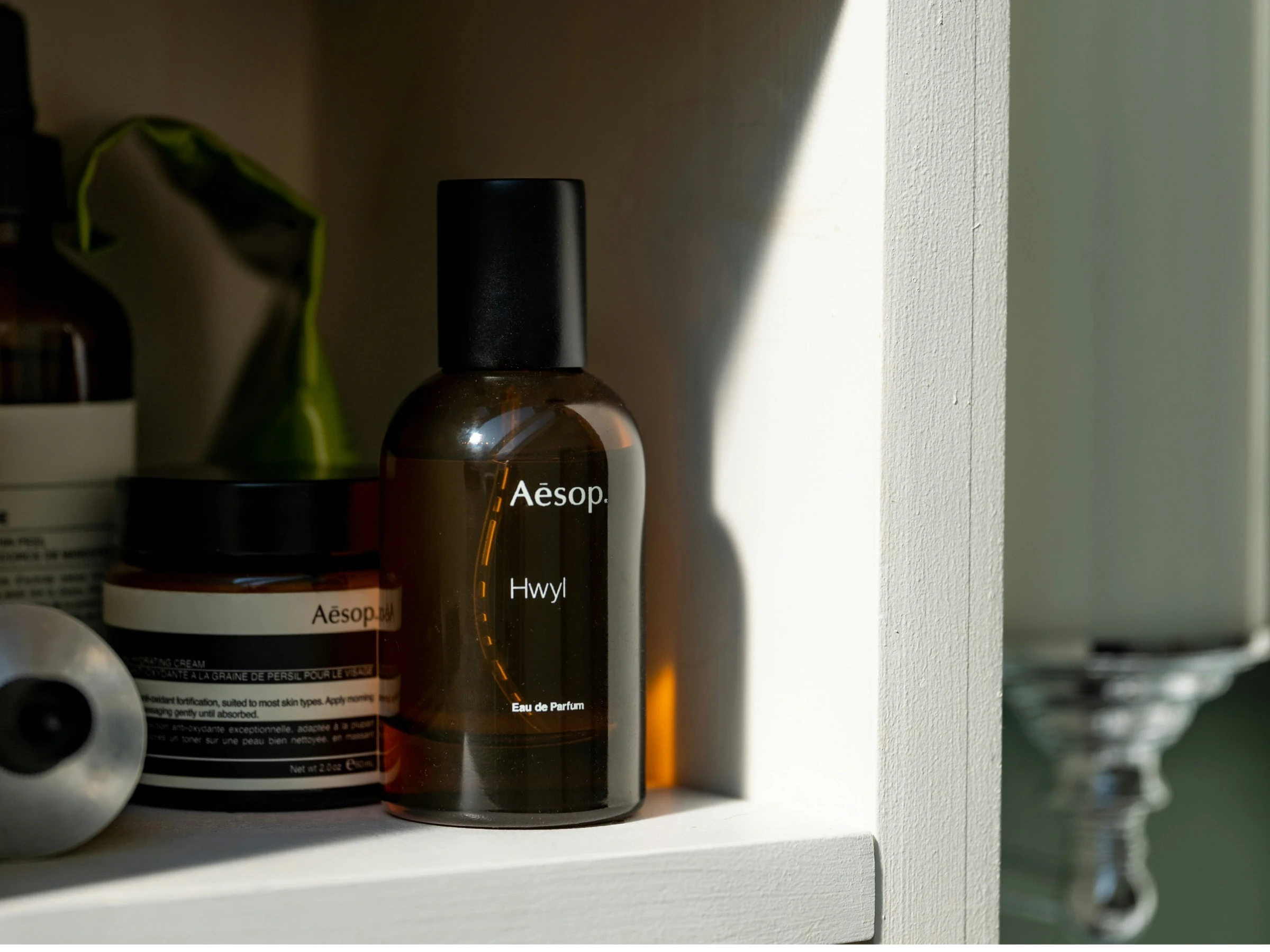
Aesop goes the other way: amber bottles, cream labels, black type, controlled spacing, sparse shelves, quiet stores, serious materials. It feels closer to an apothecary, architecture practice, or very expensive art book publisher than a typical personal care brand.
That restraint isn’t emptiness. It’s confidence.
Aesop doesn’t look like it’s trying to convince everyone. That’s the trick. Premium brands often gain power by refusing to over-explain themselves. The customer has to move slightly towards the brand. You get it, or you don’t.
That’s a useful position to hold.
Taste is rarely signalled by excess. It’s signalled by what’s been removed.
Aesop’s restraint tells you the brand has standards. It knows what belongs and what doesn’t. The label doesn’t need to dance. The store doesn’t need to scream. The bottle doesn’t need to seduce you with metallic gradients and a made-up scientific word ending in “complex.”
It just sits there, quietly expensive.
The store as a gateway
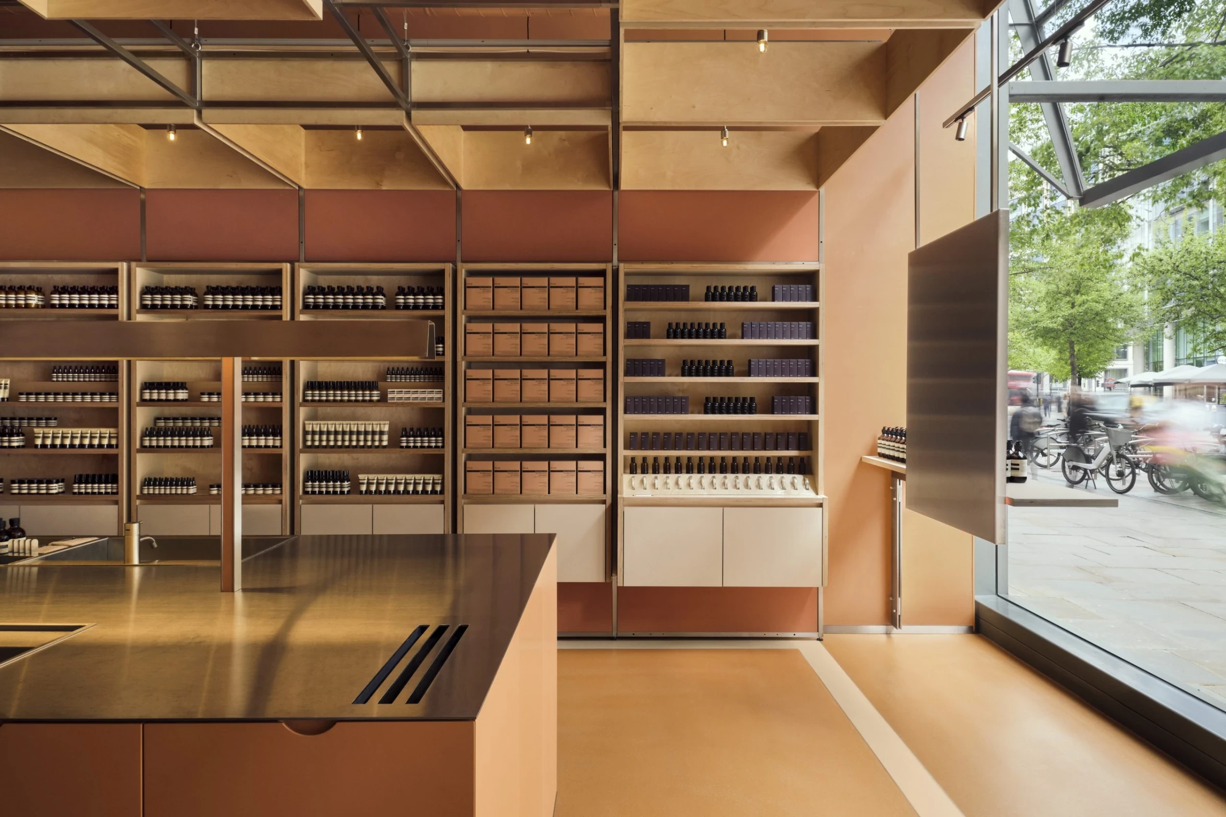
An Aesop store isn’t simply a place to buy the product. It’s the gateway into the brand’s world.
The store does the work before the product has to. You see the restraint first, then you feel it: stone, timber, steel, ceramic, glass, water, paper, pump, towel, counter, basin. Personal care starts to feel like ritual. Washing your hands becomes strangely important. Something you usually do in airport bathrooms is suddenly treated with the seriousness of wine tasting.
Ridiculous? Slightly. Effective? Completely.
Aesop doesn’t rely on visual identity alone. It moves beyond colour, logo, typography, and packaging into the fuller sensory field: touch, smell, pace, sound, space, interaction. The brand isn’t only seen. It’s handled, smelled, heard, and remembered.
That’s where premium positioning becomes real. Any brand can say it’s premium. The market doesn’t care. The experience has to make the claim believable.
Aesop builds the evidence into the room.
Selling the store feeling at home
The clever part is that the store experience doesn’t end when you leave. The product lets you take a piece of it home.
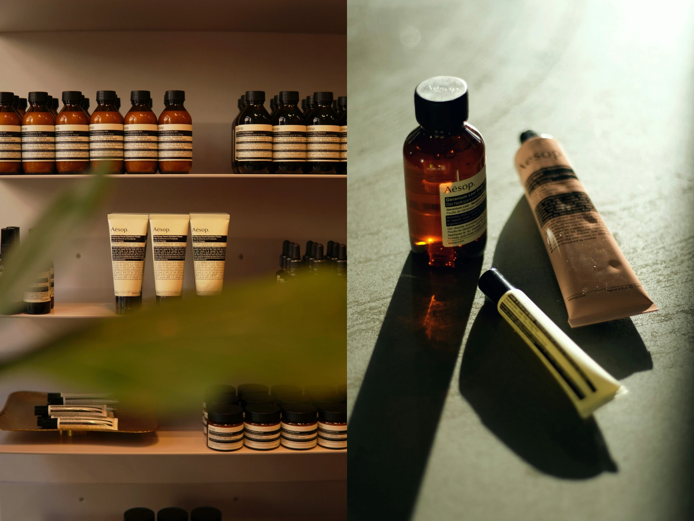
That’s why the hand wash works so well as an entry product. It sits in the bathroom or kitchen, visible to guests, used every day, quietly announcing that someone in the house has taste, money, or at least a dangerous willingness to spend both on soap.
The amber bottle becomes a domestic signal. It says: this home is considered. This person notices details. This sink has been thought about. The bathroom has a point of view, which is more than can be said for some people’s entire brand strategy.
That’s the aspiration.
Not luxury in the old obvious sense. Not gold caps, heavy perfume, glossy marble, and a campaign shot on a yacht with everyone looking faintly unemployed.
Aesop sells a more modern aspiration: restraint, intelligence, cultural fluency, sensory calm, design literacy. It’s premium without needing to look traditionally luxurious.
You’re buying the feeling of better taste, bottled for the bathroom.
L’Occitane sells Provence. Aesop sells discernment.
The contrast with L’Occitane helps.
L’Occitane has a strong world too: Provence, natural ingredients, almond, lavender, shea butter, markets, oils, creams, warmth, gifting. It’s generous, familiar, and easy to understand.
Aesop is playing a different game.
L’Occitane sells provenance. Aesop sells discernment.
L’Occitane is ingredient-led. Aesop is atmosphere-led.
L’Occitane feels abundant. Aesop feels edited.
This isn’t about pretending one brand is smarter than the other. They’re doing different jobs. But Aesop creates a sharper aura of taste. It’s less about where the product comes from and more about the kind of person you become by choosing it.
That’s powerful because premium pricing isn’t only about product performance. It’s about what the purchase allows the customer to believe about themselves.
Aesop gives the customer a flattering story: not loud wealth, not conventional luxury, taste.
Niche feeling at scale
Here’s the tension: Aesop isn’t small anymore. L’Oréal completed its acquisition of the brand in 2023, so no, Aesop isn’t niche.
It performs niche at scale.
That’s much harder. Plenty of brands feel special when they’re small. The real test is whether they can grow without flattening the thing that made people care in the first place.
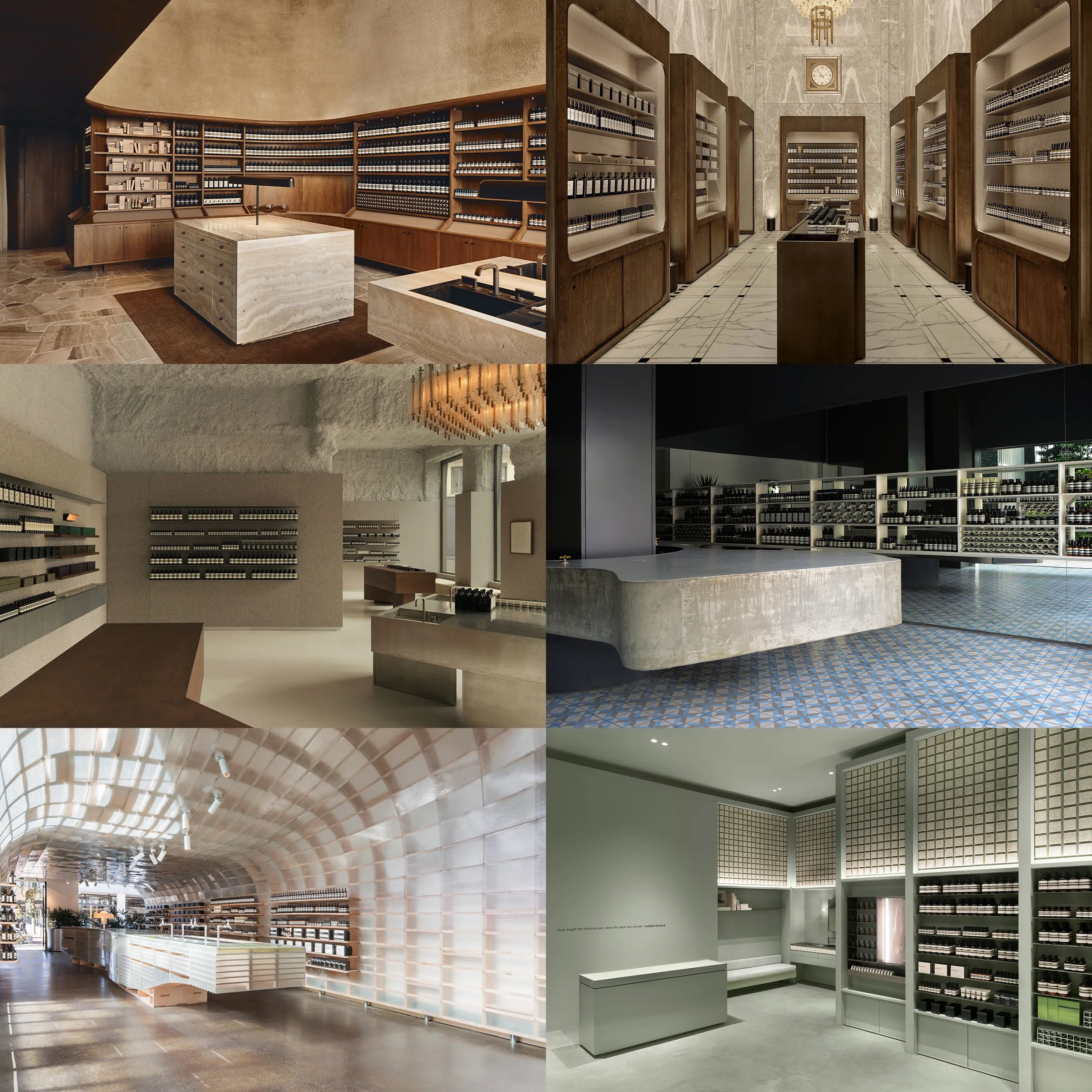
Aesop protects that feeling through its stores. They’re not rolled out as identical retail boxes. The materials change. The layout changes. The local references change. But the codes remain: restraint, quiet, tactility, ritual, scent, seriousness, controlled service, controlled language.
A weaker brand needs every location to look the same to feel consistent.
Aesop can afford variation because the idea is strong enough to travel.
The product suite as progression
Once someone buys into the world, the next purchase feels natural.
You might start with the hand wash. Then the hand balm. Then the body cleanser. Then a travel kit. Then a fragrance. Then something for the home. Then a gift for someone else, because apparently your personality now includes converting people through expensive aromatic objects.
This doesn’t feel like aggressive upselling. It feels like expanding the atmosphere.
The customer isn’t just adding products. They’re adding more of the Aesop world into their life: bathroom, body, travel bag, home, gift. Each category gives them another place to express the same taste signal.
You’re not just buying more products. You’re buying further into the taste code.
Why the price feels believable
A $47 hand wash requires belief. Aesop earns that belief before the till.
The customer has already felt the difference before they calculate it. They’ve entered the store, handled the bottle, smelled the formulation, used the sink, absorbed the quiet, received the consultation, and placed the brand in a mental category far away from supermarket soap.
That’s what brand is supposed to do. Make the price feel like it belongs.
Not decoration. Not prettiness. Not a nicer label placed on a normal product with a bigger margin and a prayer.
Aesop does this unusually well because it understands that premium isn’t always about adding spectacle. Sometimes premium is created by removing everything that feels desperate: no clutter, no shouting, no fake urgency, no mass-market friendliness wearing a black turtleneck.
Just control.
The lesson
What Aesop shows is more useful than “be minimal.”
Please don’t let the world fill up with Aesop cosplay. We’ve enough brands whispering in sans serif already.
The real lesson is that premium positioning has to be experienced before it’s believed.
Aesop uses visual restraint to signal taste. It uses store design to make the brand physical. It uses scent, touch, sound, and service to create sensory evidence. It uses unique stores to preserve niche feeling at scale. It uses the product suite to let customers bring the store feeling home, then keep extending it into more parts of their lives.
That’s why the brand has pricing power.
The product sits on the shelf. The value is built in the room.
[
MORE NOTES
]
Continue reading our latest journals
[contact]